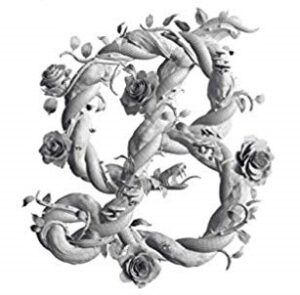
Are you tired of bad news? Me too. Let me offer you a short respite from all the doom and gloom. The topic today is beauty and, specifically, a review of a book titled, Sagmeister & Walsh: Beauty. Do a Google search on Beauty and you’ll get pages of female cosmetic products. This book isn’t about cosmetics or even human beauty. It is about architecture, design, art, graphics and the like.
Stefan Sagmeister and Jessica Walsh are partners in a design consultancy. The premise of their book is straightforward and stated on the slipcase of the book: “Over the course of the last century, beauty was displaced by functionality in design and architecture. As a result, something essential was lost. Beauty not only impacts the way we feel, it changes the way we behave. Sagmeister & Walsh show us how this shortsighted disregard of beauty can be reversed.”
I agree with the premise of the book. The authors note that the word Beauty has diminished over the last century in writing. Almost all designers and artists don’t seek beauty. Often, they state that their aim is to provoke, challenge or even disgust. With architecture, functionalism seems to be what is important. There isn’t much post-1900 art I find appealing. The same can be said for architecture. Evolution from the Bauhaus movement to today has given us housing that looks like prisons.
So, what is beauty? Many say that beauty is in the eye of the beholder; it is subjective. The authors refute this, mostly by way of a series of surveys. For example, colors are compared and blue is the favorite. Humans tend to find blue as the most beautiful color and brown is the least beautiful. As far as shapes, circles are most beautiful while rectangles the least. So why is a brown, rectangular box the most common form for apartments when most people find the color and shape ugly?
While rectangles are not the preferred shape, a rectangle representing the ‘divine proportion’ is generally the most appealing shape of rectangle. For some reason, we find this more appealing. This has been true for centuries. There are dozens of other surveys where you can test yourself and find out whether your tastes agree with the hundreds the authors surveyed.
If beauty is more objective than just “in the eye of the beholder,” then what can we do with this knowledge? The authors intend to take their Beauty Project and transform ugly buildings and neglected parts of cities into beautiful places and things. Beautiful surroundings improve our quality of life and change behavior, for the better. There is less crime in beautiful surroundings.
How about beautiful products? There are surveys in the book about labels used by various brands. Clearly beautiful products sell more than ugly ones. Beauty makes people happy and happy people buy.
Most readers of this blog are service providers. How does this apply to those in a service business? I’ve got an idea. All of you have probably gone through a process of developing Mission, Vision and Values at various organizations you’ve worked for. Have you ever seen Beauty listed as a Value for a business? I haven’t but I think it should be.
What if we did make Beauty a Value for our businesses? I don’t think Beauty needs to cost more, or not much more. I think if we intend to make everything we provide to clients, nee, everything we do more beautiful, what would that look like? I’m not talking about fussy ornamentation here. I mean, just pause, think and make an effort to do what you do in a way that considers beauty. It’s just a bit more attention to detail.
If your client proposals were a little more elegant, a little better thought through, would they be better received? Would you win more business? Would you enjoy the creative process a bit more? If your website and marketing material were a little classier and more consistent, maybe even providing a delightful surprise, would you make more money as a result? If your reports were easier to read and more useful to decision makers, would they be read by the users more thoroughly? Isn’t this a way to differentiate yourself in the market?
An Example
This book provides a good example of Beauty, as it should. The layout is clean and easy to read. There are many examples of beautiful things. And there is a hidden surprise the authors never mention. While traditional fine books often had gilded page edges, this book has silvered page edges. Do you know what fore-edge painting is? Look on YouTube if you don’t, but it is a traditional artform for fine books where an artist paints a scene on the edge of the book’s pages that can only be seen when the books pages are fanned.
This Beauty book has fore-edge designs, which I’ve never seen in a mass-produced book. Plus, the message is different based on the way the book’s pages are fanned. One way it says, “Beauty = function.” The other way it says, “Beauty = human.” I have no idea how this was done, but it provides a delightful surprise to the reader while also emphasizing the premise of the book.
Buy a copy and cherish it.


No comments yet.